Why Your Carefully Designed Streaming Background Looks Like a Mess on Camera
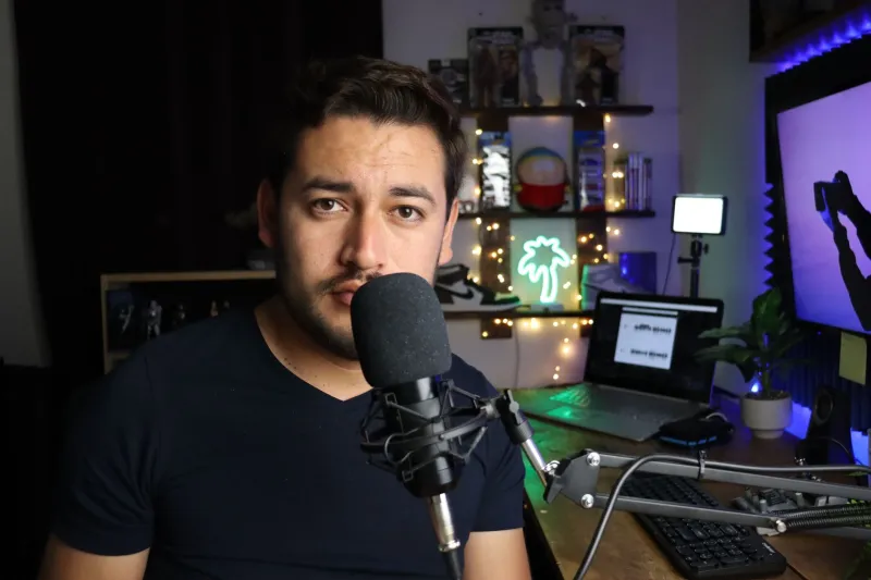
You know that feeling when you walk into your setup, look around, and genuinely feel like you've nailed it? The shelves are curated. The lighting is moody and intentional. The color palette is cohesive. Then you fire up OBS, switch to your camera feed, and the whole thing looks like a garage sale staged by someone who owns too many Funko Pops.
Welcome to the gap between human perception and camera reality — and it's wider than most streamers realize.
Your Eyes and Your Camera Are Not the Same Device
Human vision is a marvel of adaptive processing. Your eyes and brain work together in real time to adjust for lighting variations, compress dynamic range, smooth out textures, and fill in context from memory. When you look at your streaming background, your brain is doing an enormous amount of work to make it look balanced and intentional.
Your webcam or capture camera does none of that. It captures a flat, compressed image with a fixed dynamic range, and whatever falls outside that range either blows out to white or crushes down to black. Subtle color differences that read as intentional variation in person become noisy, competing tones on screen. Depth that your eyes perceive naturally collapses into a flat plane. Objects that feel spaced out in your room suddenly look crammed together in the frame.
The result is that a background designed for human eyes often fails completely when viewed through a lens — and that gap is exactly what separates a streaming setup that looks polished from one that looks cluttered.
How Video Compression Makes Everything Worse
Here's the part that really stings: even if your camera captures a decent image, your streaming platform is about to make it worse.
Platforms like Twitch and YouTube compress your video stream using codecs like H.264 or AV1. These codecs work by identifying areas of visual complexity and reducing detail to save bandwidth. The more visual complexity in your frame, the harder the codec has to work, and the more compression artifacts get introduced into your image.
What counts as visual complexity? Busy backgrounds. Fine details. High-contrast edges. Texture-heavy surfaces. Basically, all the things that make a background look interesting in person are exactly the things that make compression algorithms work overtime and turn your stream into a blocky, artifacted mess.
This is why streamers who look crisp and clean on camera almost always have relatively simple, low-detail backgrounds. It's not laziness — it's compression science.
The Color Theory Problem
Let's talk about color, because this is where most streaming backgrounds go wrong in ways that are invisible until you see them on screen.
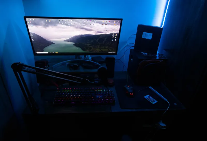
RGB LED strips are everywhere in streaming setups right now, and they look genuinely cool in person. The problem is that saturated, high-intensity color lighting does unpredictable things to camera white balance and skin tone rendering. A purple backlight that looks tasteful to your eyes can shift your face to look sickly or washed out on camera depending on how your webcam's auto white balance decides to interpret the scene.
The rule of thumb that professional broadcast designers use: desaturate your background lighting and boost your key light (the light on your face). A softer, warmer key light at around 5500K–6500K color temperature, combined with dimmer, less saturated accent lighting behind you, will almost always produce a more flattering and stable on-camera image than equal-intensity RGB everywhere.
For background colors themselves, avoid anything that's too close to your skin tone — it reduces contrast and makes you look like you're dissolving into the set. Cool, medium-value backgrounds (think desaturated blues, deep grays, muted greens) tend to separate from skin tones naturally and compress cleanly.
The Clutter Paradox
Here's the counterintuitive part: less interesting backgrounds often look more interesting on stream.
This goes against every instinct streamers have when designing their space. You want personality. You want viewers to see your book collection, your figures, your awards, your plants. And in person, all of that reads as layered, interesting, human. On a compressed 1080p stream, it reads as visual noise that your audience's eyes don't know where to rest.
The fix isn't to strip your background down to a blank wall. It's to think in terms of focal points rather than collections. Pick two or three intentional elements to feature in frame and let everything else fall outside the shot or into soft background blur. A single well-lit shelf with a few deliberately spaced objects will read as more curated and intentional on camera than five shelves packed with stuff — even if the packed shelves look incredible in your actual room.
Depth helps enormously here. If you can position your hero background elements at least four to five feet behind you, your camera's natural depth of field will start to soften them slightly, which paradoxically makes them look more cinematic and less chaotic on screen.
Lighting Placement: The Single Biggest Lever
If you change one thing about your streaming setup based on this article, make it your key light placement.
Most streamers light themselves from the front or from both sides equally, which flattens the face and removes the natural shadow structure that makes faces look three-dimensional. A single key light positioned slightly to one side and slightly above eye level — think 10 o'clock or 2 o'clock position — creates natural facial shadow that reads beautifully on camera and gives your image a professional, broadcast-quality feel without expensive equipment.
A $50 ring light or a cheap softbox from Amazon, positioned correctly, will do more for your on-camera presence than a $400 camera upgrade. Get the light right first, every time.
Designing a Background That Works Both Ways
Here's a practical checklist for building a streaming background that looks intentional in person and through the lens:
- Limit your color palette. Two or three colors maximum in the background frame. Cohesion reads as intentional on camera.
- Reduce texture density. Brick walls, heavily patterned fabrics, and busy wallpaper all compress badly. Smooth, matte surfaces are your friend.
- Control your lighting zones. Bright on your face, dimmer and less saturated behind you.
- Think in thirds. Position your focal background elements in the left or right third of your frame, not centered behind your head.
- Test on stream, not in person. Before you commit to a setup, run a test stream and watch the VOD. What you see in the playback is what your audience sees — and it's almost always different from what you see when you're sitting in the room.
See Your Setup the Way Your Audience Does
The biggest mindset shift for streamers designing their workspace is learning to think of the camera as the primary audience, not themselves. Your setup doesn't need to look perfect from your chair. It needs to look perfect in a 1080p H.264 stream at 6,000 kbps, viewed on a 27-inch monitor or a phone screen by someone sitting on their couch in Ohio.
Once you start designing for that viewer instead of for yourself, everything about your background decisions changes — and usually gets simpler, cleaner, and a whole lot more effective.